Ladose
Branding | Packaging
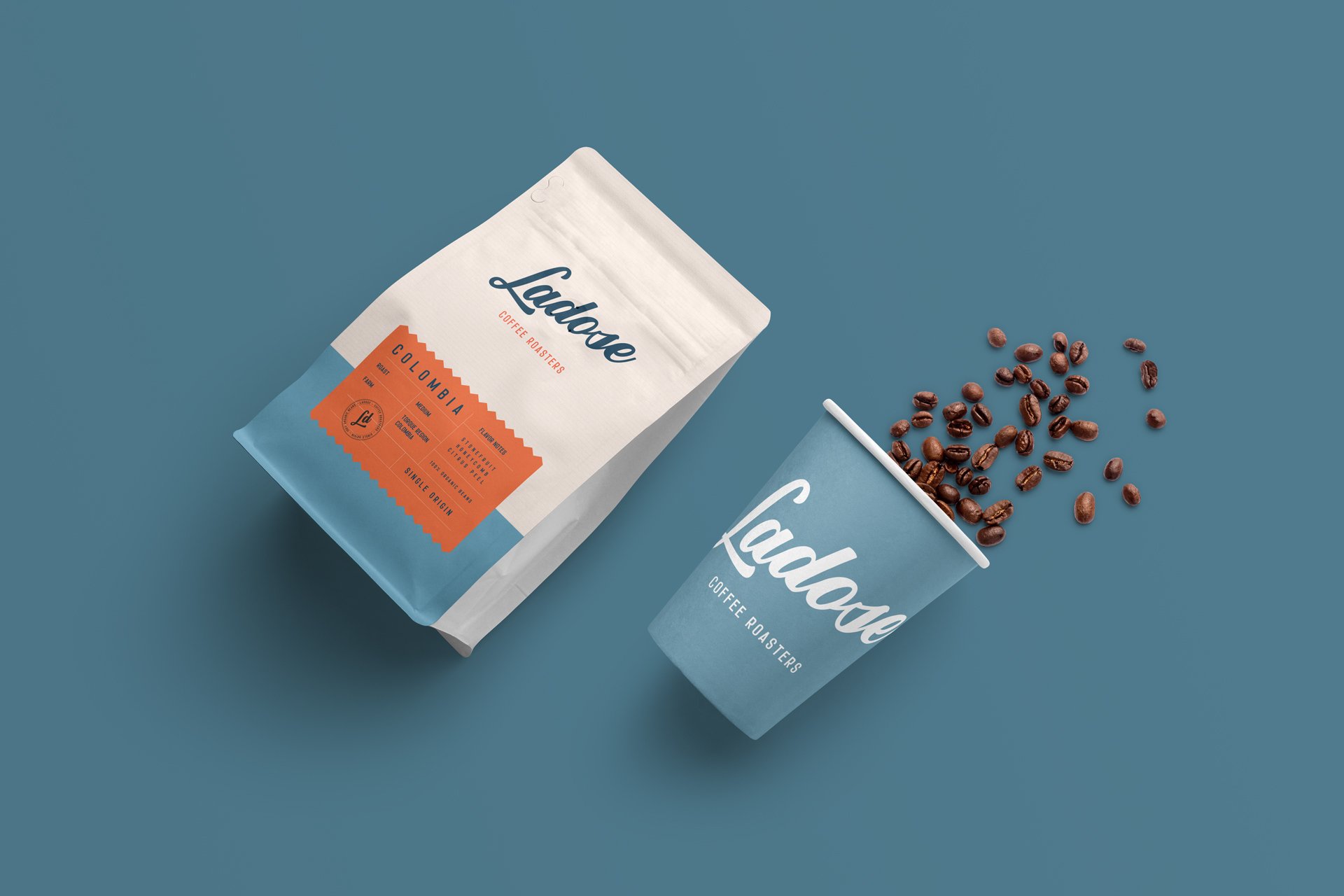
For Ladose I designed both the logo and the packaging, utilizing bright colors and a minimalistic approach to create an eye-catching and contemporary look. The goal was to develop a brand identity that stands out on the shelves while conveying the lively and dynamic nature of Ladose’s coffee.
The primary challenge was to balance minimalism with a bold, engaging visual appeal. I achieved this by incorporating bright blue and orange hues into the design, creating a striking contrast that draws attention. For the packaging, I maintained a sleek layout with ample white space, allowing the vibrant colors and essential product details to shine without overwhelming the viewer.
This approach successfully captures the energetic spirit of Ladose while maintaining a sophisticated and modern aesthetic.