Kouparanidis Construction
Logo | Visual Identity
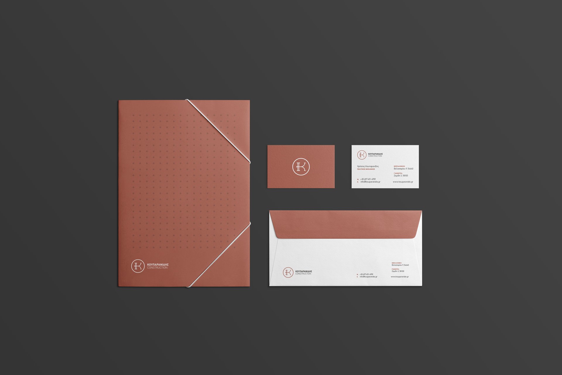
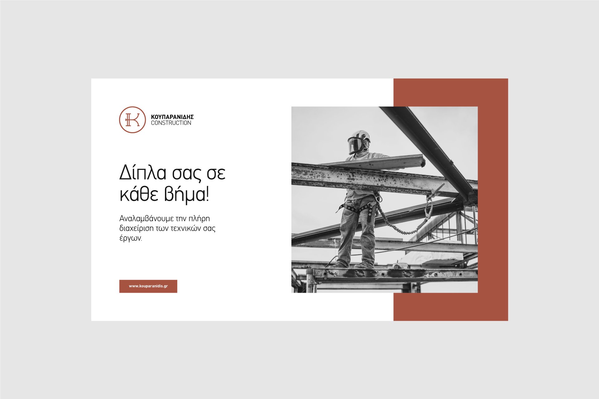
Kouparanidis, a leading construction company, tasked me with creating an elegant and sophisticated logo that would embody their strength and reliability. The objective was to develop a distinctive visual identity that stands out in the construction industry, emphasizing the company’s professionalism and trustworthiness.
The centerpiece of the design is a refined letter 'K', crafted to reflect both the elegance and robustness of Kouparanidis. The main color of the brand is terracotta, symbolizing stability and earthiness, complemented by black and grey tones that add depth and a modern touch. The combination of these colors creates a striking yet harmonious visual appeal, reinforcing the company’s commitment to quality and excellence.
The result is a logo that effectively communicates the core values of Kouparanidis and enhances its brand presence. The elegant design has been positively received, contributing to stronger brand recognition and helping Kouparanidis stand out in a competitive market.